Fintech, mobile
Seylan Bank mobile app
Redesigning Sri Lanka’s leading mobile banking experience for simplicity and trust.
- Role
- Product designer
- Domain
- Banking
- Platform
- Mobile app
- Research
- App reviews, interviews
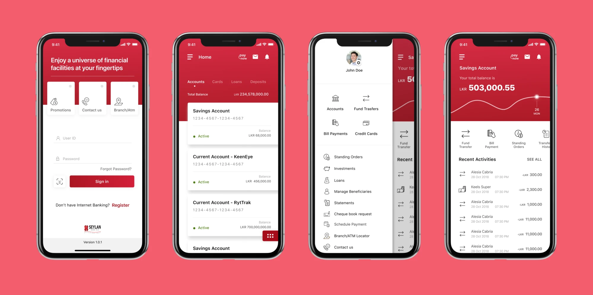
Overview
Banking is evolving fast, and Seylan Bank, a prominent financial institution in Sri Lanka since 1987, is no exception. This is my redesign of their mobile banking app.
It was also a milestone in my career: the first mobile app project I took on as a UX designer.
The problem
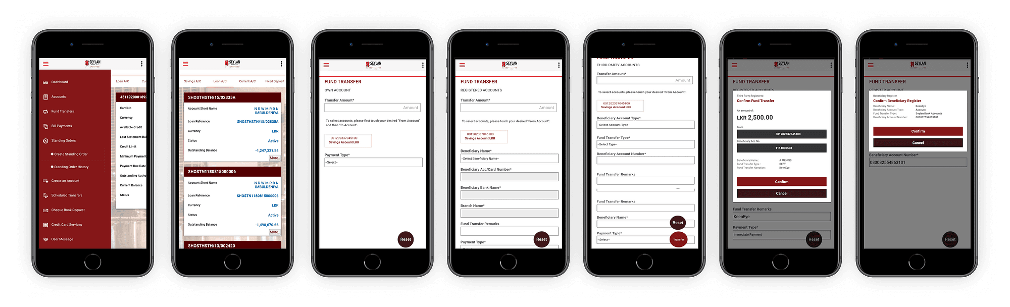
Beyond the standard features of most banking apps, Seylan’s app offered extras: finding the nearest branch, managing standing orders, making inquiries, and handling credit cards, loans and deposit summaries.
But many of these features were overly complicated and led to broken experiences. Even essential tasks like transferring money and paying bills were cumbersome, needing too many steps and running into real limits within the app.
Research: what app reviews told us
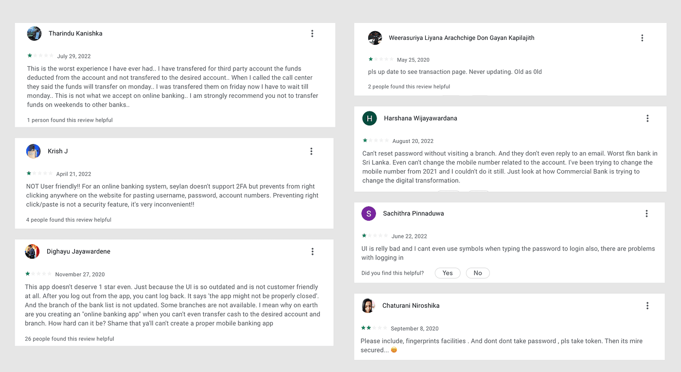
The app held an average rating of 2.1 out of 5. Many people were frustrated with its outdated design and limited features. Reading through a large number of reviews, I found recurring pain points that pointed to common problems with how the app worked.
1. Interface
Many people described the app as outdated, lacking modern design and with an unintuitive layout. Compared with other banking apps it felt “very basic”, which frustrated users.
2. Experience
Logins failed and sessions ended unexpectedly, transactions ran into processing problems, and frequent crashes made the whole experience feel unreliable.
3. Feature gaps
People asked for modern features like fingerprint login or token-based authentication, and raised concerns about password security and ease of use. Reviewers also noted the app lacked features other banks offered, such as better account management and responsive support.
4. Support
Users reported slow or missing responses from customer service, especially for technical problems, and poor communication about updates left them unsure what was changing or how to fix issues.
5. Competitors
Several reviewers suggested Seylan look to other local banking apps such as Sampath and NTB, which they saw as better in usability and performance.
6. Brand impact
Negative reviews showed declining trust in the Seylan brand. Some said the app shaped their view of the bank itself, and a few were even reconsidering who they bank with.
Together these insights showed significant usability challenges and a clear need for better UI and UX, new features and stronger support to make the app competitive and reliable.
Talking to real users
Personas
From interviews with users, we built personas around demographics, motivations and end goals, clustered them into segments, and referred to them throughout the design process.
Competitor analysis
We compared Seylan with other prominent banks, capturing screens across competitors and evaluating their content and processes. We wanted to deliver something distinctive and build the brand value of Seylan Bank PLC.
Research insights
Great experiences start with great research, so we focused on what customers expect from a banking app. The features people found most important were checking their account balance, transferring money between accounts, paying bills, and checking recent transactions.
We also uncovered many pain points and a significant number of complaints, some of which surprised us, along with how customers perceived the service. We summarised the research and moved on to designing the best possible solutions.
Simplifying complex banking
Most people found the experience complex: processes were long, there were too many fields to fill in and steps to go through, and some banking terms were unfamiliar.
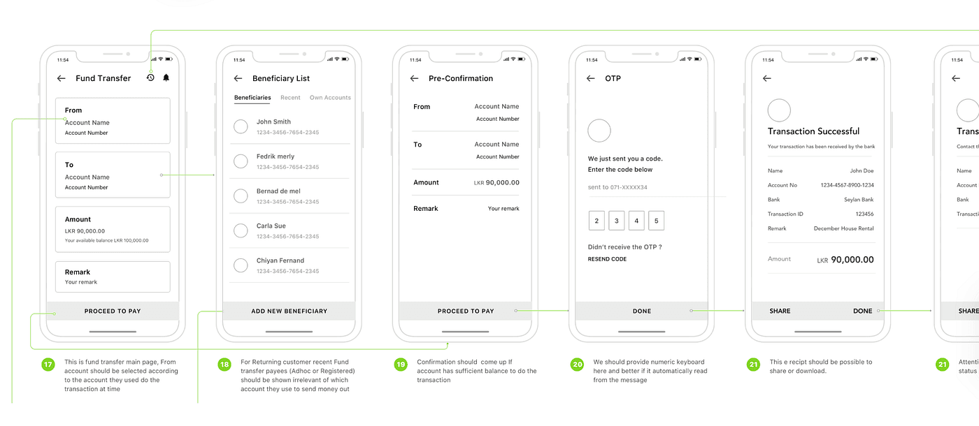
Modern users want faster ways to finish transactions in a simple flow. So we focused on the information each process really needs, let people finish in a few taps, and made the most frequent tasks clearly accessible with simple navigation.
Sketching and wireframing
With insights gathered and analysed, we drafted basic wireframes. It was the right moment to work through user flows, and it gave us a clear vision of the app’s structure.
Designed for clarity and trust
A refreshed look and feel
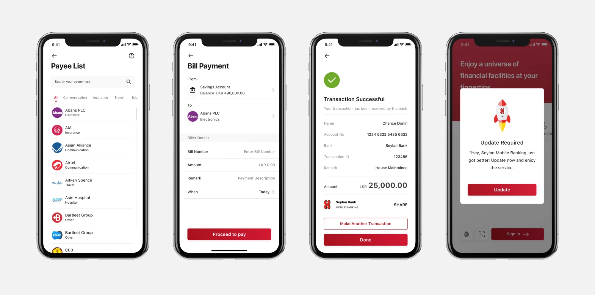
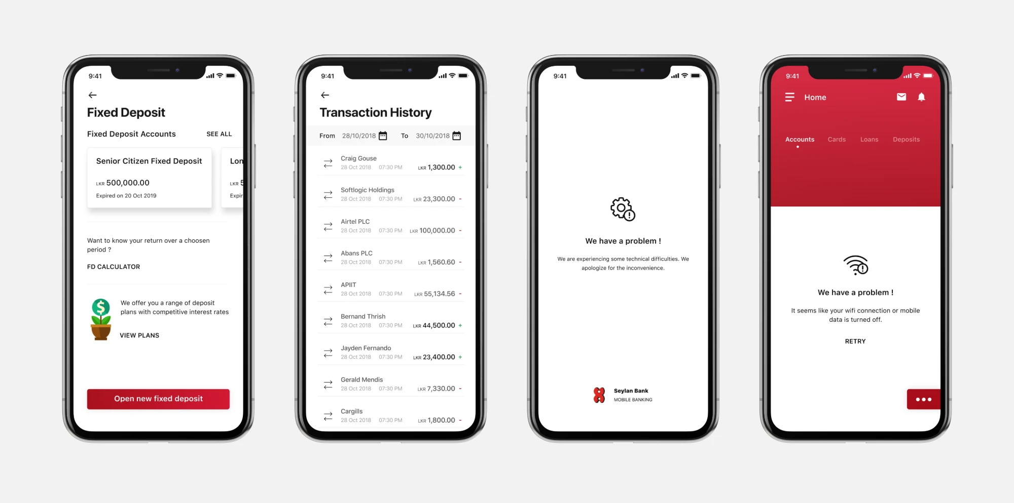
A bank’s app reflects its brand, so it needs to look current. We designed a clean, minimal interface that is easy to use, easy to understand and helps people reach their goal quickly.
Built to earn trust
Banking customers need to know the service does exactly what it says. Just like in real life, honesty builds trust, and it’s critical to a banking product. So we always show details like extra charges, tax and timing clearly, to help people feel confident.
How I arranged my Figma artboards
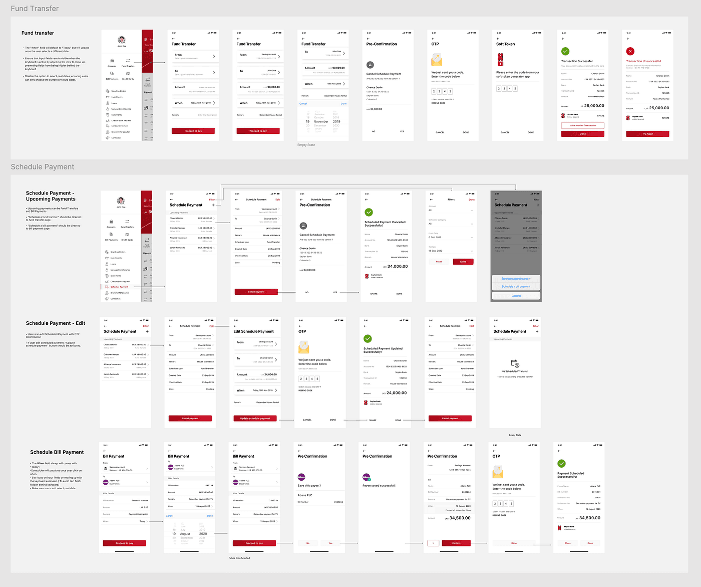
To keep the design process smooth and collaborative, I organised the Figma file carefully.
A logical flow of screens
Artboards follow the user flow in sequence, from onboarding through the home dashboard, transactions and settings. Stakeholders could follow the journey from start to finish.
Grouped by feature
Screens for each feature, such as account overview, money transfers and bill payments, sit together, so feedback sessions could focus on one feature at a time.
Conclusion
Redesigning the Seylan app taught us that great user experience is not a destination but a continuous journey. Focusing on people’s needs, embracing feedback and committing to continuous improvement helped us reach our goals and laid the foundation for what comes next, positioning Seylan as a customer-centred leader in Sri Lankan digital banking.